This list aims to give clear, practical retro computer keyboard build inspiration for serious collectors and daily typists alike.
We define the look and feel by layout cues, case silhouettes, keycap profiles, switch sound, and era-specific legends. Expect references to terminals, 1970s–80s home systems, classic Apple boards, and IBM collector icons.
Readers will find three paths: buy modern boards with vintage styling, assemble a custom board that follows old design language, or restore genuine vintage pieces and harvest parts. The article is organized like a plan: design principles first, then iconic inspirations, modern blueprints, and restoration tips.
Note: sourcing in the United States can affect availability and price. Some grail pieces are best kept for display rather than daily use. This list balances nostalgia with real-world practicality for collectors and enthusiasts.
Why Retro Keyboard Design Still Feels Fresh on a Modern Desk
Old board styling still cuts through modern minimalism with unusual silhouettes and purpose-made accents. That contrast makes vintage cues read as new again when placed on a contemporary desk.
Oddball layouts and bespoke keys signal a particular era. Early terminals and home systems shipped with non-standard layouts and purpose legends. DEC’s famous “GOLD” key is a concrete example: a single key that instantly points to a specific piece of history and operating model.
Big bezels, stepped caps, and lock lights form a clear design language. These elements frame the key field like industrial gear. They make the plate feel like a tool, not just a surface.
Collectors chase tactile memory: the chunky travel, taller caps, and pronounced tactility give typing a deliberate, satisfying feel. That travel and the audible click or clack matter as much as looks—sound acts as confirmation and nostalgia.
- Visual variety beats homogenous modern styling.
- Bespoke legends anchor a board to specific decades.
- Tactile and acoustic cues complete the sensory package.
This article walks through how to recreate those cues without needing a museum-grade original, from parts choices to small mod work that preserves the classic feel and sound.
Retro Computer Keyboard DNA: Layout Cues Worth Copying
Small layout choices—like offset clusters and split function rows—define whether a board reads as era-authentic or merely vintage-tinged.
Function-row experiments and non-rectangular clusters
Function-row experiments
Older systems often used staggered or widened function rows. Try uneven spacing or a separated block to hint at that era while keeping modern utility.
Non-rectangular clusters
Separated nav/edit islands, asymmetric macro columns, or blockers translate nicely to 65%, 75%, and 1800 layouts. You get character without losing daily comfort.
Wedges and aircraft-carrier silhouettes
Wedge profiles, rounded-rectangle fronts, and oversized bezels make a case feel industrial and dated. Pick one strong shape to anchor the design.
Legends, icons, and keycap storytelling
Text-heavy legends, symbol sets, or OS-specific keys instantly place a board in a period. Use a targeted keycap set—terminal-style sublegends or era-colored modifiers—to tell the story.
- Copy 2–3 cues, not the whole original.
- Match case shape to legend language for coherence.
- Keep spacing functional while adding visual quirks.
retro computer keyboard build inspiration from Iconic Vintage Boards
Look to museum-worthy models for clear lessons on silhouette, bezel treatment, and legend language. These iconic boards act as a concise hall of fame you can copy one cue from without cloning an original.
IBM Beam Spring: towering feel and collector presence
IBM Beam Spring teaches presence. Its heavy case, tall caps, and loud actuation make it feel monumental. Modern projects mimic this with tall profiles and clicky switches to get that same stature.
Apple M0110 and the extended era
The Apple M0110 shows clean industrial proportions and distinct Apple-era legends. Use tight bezels and subtle iconography to evoke that era without copying exact tooling.
Home colorways: Commodore, Amiga, Atari, BBC, Symbolics
Commodore 64 / Amiga A500 prove warm neutrals plus bright modifiers photograph well and read as home nostalgia.
Atari 800/XE suggests wedge cases and bold accent keys that translate into modern extruded-front case concepts.
BBC Micro highlights a memorable function row — make that row visually distinct to create a signature element.
Symbolics Space Cadet pushes maximalist legends. Consider a keyset that tells a story rather than hiding in minimalism.
- Use one or two cues from each model to keep designs coherent.
- Prioritize silhouette and legend language for collector appeal.
Collector-Grade Alps Boards and Their Build Takeaways
Alps-era machines occupy a niche where tactile personality and era-specific styling meet real-world utility.
Zenith Z150 with Alps Greens
Zenith Z150 models with SKCL Greens show how a gold badge and bold legends grant presence. The heavy case, tall caps, and clicky actuation give a formal, terminal-like vibe that suits display and serious typing.
Magnavox Videowriter with Alps Browns
The Magnavox Videowriter often surfaces as a cleaner find. Word-processor units tended to see lighter use, so SKCM Browns may show less wear. That makes them good targets if you want usable keycaps and nicer switch condition.
What to know before you buy
Vintage Alps require patience. You may need to open, clean, and sometimes repair switches after decades of storage.
- Check for key binding, scratchiness, and uneven return.
- Look for crude repairs or missing stabilizers.
- Expect to clean contacts and desolder if you harvest parts.
Takeaway: even if you skip harvesting Alps switches, copy the legend style, case proportions, and the “serious equipment” aesthetic for modern custom work.
Modern Retro Keyboards You Can Buy and Use as Build Blueprints
A production board gives consistent color, fit, and finish so your desk looks cohesive quickly. Buying ready-made boards is the fastest route to a classic look because you get warranty support, modern connectivity, and steady manufacturing quality.
Leopold FC900RBT: classic beige done right
The FC900RBT is a full-size baseline for studying color balance and legend contrast. Use it as a visual blueprint: note the case proportions and how modifiers read against a warm beige.
Unicomp Model M: buckling-spring heritage for real enthusiasts
Unicomp brings near-authentic buckling-spring feel with modern support. It’s the pick if you want the tactile legacy and durable switch action without long restoration time.
Epomaker RT100: CRT-styled LCD meets high-speed wireless
The RT100 is a hybrid: gamer-friendly 2.4GHz dongle plus Bluetooth and a customizable, CRT-like LCD. It blends nostalgia cues with modern convenience and useful programmable features.
CIDOO V65: metal beige case in a compact 65% layout
CIDOO nails the material cue with an all-metal, beige mini case. The 65% layout keeps desk real estate low while preserving key character for smaller setups.
- Why buy: warranty, consistent production, and reliable connectivity save effort.
- Pick by use: choose wired or 2.4GHz for stable office use; Bluetooth for flexible desk swapping.
- Match features to life: prioritize switch feel, extra knobs, and ports based on where you type most over time.
These ready-made options let collectors and daily typists replicate period cues quickly while keeping modern reliability. Compare specs and try them where possible before committing.
Retro Gaming Colorways and Pop-Culture-Inspired Builds
Gaming nostalgia centers on recognizable console palettes and bold brand cues rather than small layout experiments. That color-first approach makes a board read like a favorite system at a glance.
How it differs: terminal-era recreations focus on silhouette and legend language. Gaming editions lean into decals, bright modifiers, and licensed art to trigger memory fast.
NES vibes and the Durgod Fusion
The Durgod Fusion channels an NES palette and adds modern convenience with bluetooth and a hidden USB receiver. Availability and pricing vary by retailer and region, so expect fluctuations when shopping.
8BitDo Retro Keyboard: function-forward nostalgia
8BitDo’s $99 board stands out for heft, an aluminum frame, and multi-mode connectivity (Bluetooth/2.4G/wired). It uses Kailh Box White V2 switches for a crisp, clicky feel.
The board includes two twisting knobs for mode switching and volume, plus oversized A/B programmable button keys that act as real accessories for macros.
Higround x Pokémon: premium themed route
Higround’s collaboration offers high-grade printing, a compact 65% layout with arrow keys, and matching desk mats and other accessories. It’s a polished way to own a licensed look without sacrificing typing quality.
Keep it usable: avoid theme overload by pairing bold art with neutral mods or a calm case color. This simple list of choices keeps the design legible and long-term friendly for daily use.
Typewriter-Style Retro Builds Without the Typewriter Hassle
Typewriter aesthetics translate into modern desks when designers keep the charm but drop the upkeep. You get round caps, metal cues, and a writer’s-desk mood without sticky mechanics or heavy servicing.
Qwerkywriter S: typewriter aesthetics with Bluetooth convenience
The Qwerkywriter S leans hard into vintage styling while offering modern Bluetooth connectivity. It is the high-aesthetic option for home or office use where vibe matters as much as function.
Azio Retro Classic and Azio Retro: round-key, metal-heavy options
Azio’s models give round-key feel with solid metal cases that fit into everyday tech setups. They are easier to integrate for regular work than a full typewriter replica.
- Appeal: round keys and brass cues create a writerly presence.
- Typing: round caps can be polarizing—test for long sessions.
- Pairing: brass desk accessories, warm lighting, and muted mods keep the design coherent.
Note: aesthetic-first choices are fine, but prioritize comfort if the unit will see daily work.
Compact Retro Builds for Travel and Hybrid Work Setups
Portable classic-look boards aim to balance style, connectivity, and enough keys for real work.

The niche for compact, nostalgic gear grows because hybrid routines mean people need familiar typing at home and on the road. A small board makes that shift frictionless while keeping a period look.
AYANEO x Nuphy: a portability-first option
The AYANEO x Nuphy collaboration uses a Game Boy-like palette and an 84-key layout. It is slimmer than many classic reproductions and aims to be a true travel companion. The coverage keeps common keys accessible for daily use.
Choosing layouts for carry: 65% vs 75% vs 98%
What matters for travel: slim profile, bag fit, and reliable wireless like bluetooth or 2.4GHz. Also important is keeping enough keys to avoid productivity loss at your desk.
- 65% — minimal footprint; arrows kept, no function row. Pick this when you need the smallest packable option.
- 75% — compact with function row retained; a good middle ground for frequent travelers who want F-keys.
- 98% — near-full layout with numpad; choose this when spreadsheets or data entry are one’s daily priority but you still want a smaller case.
Decision rule: use 65% for minimal carry, 75% for balanced utility, and 98% for number-heavy tasks. Build a simple travel set: one compact, consistent keycap theme across your collection so muscle memory transfers between desks and keyboards.
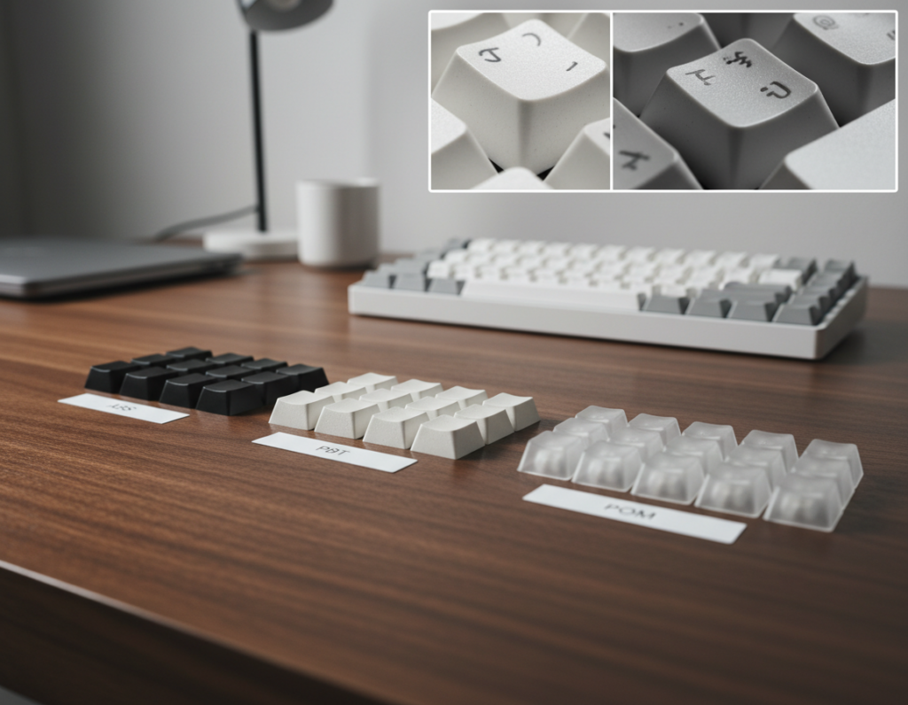
Keycap Choices That Instantly Make a Board Look Vintage
A single keycap set can reframe a board from modern to decades-old at a glance.
Why it matters: swapping caps is the fastest, least expensive way to change a board’s visual design and tone. A thoughtful cap choice signals era and function before anyone types a character.
Why SA reads “terminal era”
SA profile is tall, sculpted, and close in feel to Selectric and early Apple caps. That height and concave sculpt recreate the IBM Selectric and Apple II vibes used across certain years of office gear.
MT3 and ASA as shorter options
MT3 and Akko ASA keep sculpted rows and presence but cut overall height. They are an easier adaptation for daily users who want vintage cues without a long break-in period.
Legends and color blocking
Choose ASCII-style sublegends or icon-heavy caps to read as authentic. Ultra-minimal legends push a set toward a modern, stripped style.
- Warm whites and beiges create period-accurate palettes.
- Darker function clusters define a visual hierarchy.
- Accent keys should match the target era for clarity.
- Pick a single era per project to avoid mixed signals.
What to avoid for authenticity
Avoid Cherry and OEM cylindrical profiles if you want a true vintage look; they tend to register as contemporary even in neutral colors.
Final way forward: pick a cap set that matches your intended era—terminal, early PC, home system, or later workstation—and let profile, legends, and color blocking tell the story.
Switches and Sound: Recreating Classic Click and Tactility
Sound and tactile response matter as much as looks when you want a period-authentic typing experience. Pick a set of switches that matches the project’s intent: loud and present for display, or tactile and restrained for shared spaces.
Going loud: Kailh BOX Jade and ultra-clicky options
Kailh BOX Jade is the go-to for maximum click and presence. Each press announces itself with a sharp, nearly metallic click that reads as era-accurate for collectors who prize audio drama.
Classic mainstream click: Cherry MX Blue
Cherry MX Blue offers a familiar, accessible click that approximates the classic sound without boutique sourcing. It’s widely available and works as a practical stand-in when you want a recognizable retro voice.
When feel matters more than noise for office setups
Sound and feel are not identical. A switch can be loud but lack satisfying tactility. For long typing sessions, prioritize the physical feedback as much as volume.
- If noise is an issue, choose tactile or silent options and add dampening mods.
- Test before you commit: use a small sampler pack or a hot-swap mechanical keyboard to try presses in real use.
- Remember: presses that thrill for five minutes can fatigue over a full workday, so match sound and feel to purpose.
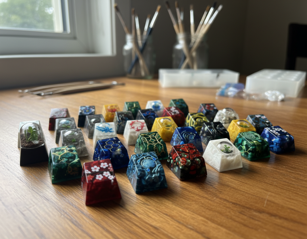
Restoring and Harvesting Vintage Parts for Authentic Builds
Sourcing original hardware means deciding whether to restore a whole unit or harvest a few prized components. Restoring keeps the story intact; harvesting supplies authentic keycaps, switches, and stabilizers you can reuse in a modern layout.
Where to hunt in the US
- eBay — broad selection and shipped listings, great for finding rare items and comparing prices.
- Facebook Marketplace — local deals and quick pickups; good for low-cost finds without shipping.
- Thrift stores — surprise finds and cheap cases; ideal when you want quantity over immediate quality.
- Electronics recycling centers — bulk scores if you have time to sort through units.
Cleaning workflow and decision
Use an ultrasonic cleaner for keycaps and small plastic parts to remove grime quickly and safely. For large case parts, choose a brush-and-soap method with plastic-safe scrapers to avoid warping.
Essential tools and desoldering basics
Pack a basic electronics repair kit, a wire keycap puller, and a switch puller to avoid damage. For soldered switches: heat the joint with a soldering iron, use a desoldering pump to clear solder, and remove the switch while protecting PCB pads.
Plan everything: photograph each step, bag labeled parts, and note condition. Restoration takes time, but the resulting quality and provenance are often worth the effort. For tips, check community posts and saved links for workflow examples before you start.
Retro Build Checklist: Features to Prioritize Before You Spend
Prioritize real-world features over flash so your purchase fits daily life and your collection. A short checklist keeps nostalgia from leading to regret.
Connectivity choices
Wired is the most reliable for low-latency work. Choose it for gaming or heavy typing sessions.
Bluetooth is best for switching between devices without a dongle. A 2.4GHz dongle gives lower latency than Bluetooth and often beats battery-heavy setups.
Knobs, buttons, and extras
Knobs and a dedicated volume wheel add real utility. Look for mode-switch knobs like those on some 8BitDo boards.
Large programmable buttons can act as macros or quick toggles—decide how many you will use before adding them.
Case materials and quality cues
Metal frames and heavier cases signal better durability and long-term quality. Check for tight tolerances and stable feet to avoid wobble.
Match the piece to your collection
Decide if an item is a display grail or a daily typist. If you plan daily use, favor practical layouts (arrows, F-row, numpad) over purely thematic touches.
- Prioritize layout practicality before theme.
- Factor in total build budget: keycaps, switches, tools, and possible restoration costs.
- Pick the features that support how you work, not just how it looks.
Conclusion
The best nostalgic designs marry silhouette, sound, and practical layout so a board lives on your desk, not a shelf.
Choose one path: buy a modern model, modify a mechanical keyboard with the right keycap set and switches, or restore an original for full authenticity. Each route trades time, cost, and provenance differently.
Use IBM and Apple classics for silhouette and legends, pick Commodore or Atari palettes for color, and reference Space Cadet for maximalist keys and lore. Add Bluetooth, knobs, volume controls, or accessory buttons only when they serve use and keep the style coherent.
Next step: pick one model as your visual reference, lock a compatible layout, and commit to a keycap profile plus a sound profile that fits your work. The best pieces earn their place by being used, photographed, and enjoyed across years.
Suggestion: include comparison tables, shopping and restoration links, and a running checklist in the article to replicate the process reliably.