What this phrase means today: it points to understated sets that favor neutral tones and low-contrast legends over loud novelty themes. Makers and buyers choose restraint to keep a clean, professional look.
The keyboard sits at the center of many U.S. home offices and corporate desks. A thoughtful build can lift the whole workspace and create a calmer, more intentional vibe.
This buyer’s guide cuts through noise. You will learn how to pick a scheme, judge material and legend durability, and confirm compatibility before you buy.
Major decisions include matching harmony with your existing setup, choosing a profile for typing feel, and weighing value sets versus premium kits.
Most sales are for keycaps only, so this guide shows how to pair sets to a keyboard layout and your switch choice.
Goal: help you narrow options fast and buy a cohesive set that performs well for daily typing and desk design.
Why subtle keycap palettes look better in modern U.S. workspaces
An understated keyboard set can quietly lift a home office without stealing focus.
Minimalist design principles that translate to keyboards
Restraint, repetition, and purposeful contrast keep a desk calm. When elements repeat—shape, tone, and small accents—the setup feels cohesive and less noisy.
Neutral tones that feel timeless
Warm greys, soft taupes, creamy ivories, and muted beige work with many furniture finishes. These neutrals pair well with wood desks and metal stands in common U.S. offices.
Choosing a single scheme that echoes your existing setup reduces visual competition. The result: a cleaner desk and a calmer room.
Tonal contrast for depth without visual noise
Use close shades for depth—legends slightly lighter or darker than caps read premium without flash. That subtle contrast adds clarity while keeping the overall color scheme soft.
Surface textures matter too: matte or lightly textured finishes hide fingerprints better than glossy ones and look cleaner under daylight. Those choices support longer periods of focused typing by minimizing distractions.
Choose a color scheme that matches your existing setup
Pick a scheme that echoes your room and makes your desk feel intentional. Start by matching major finishes—desk wood, monitor bezels, and lamp tones—so the set complements what you already own.
Cloud minimal
White base with light grey legends keeps a bright desk airy and readable. Use this when sunlight or bright lamps are common in your workspace.
Warm neutral
Beige caps with brown accents pair well with walnut furniture and soft lighting. This combo creates a cozy mid-century vibe without leaning too yellow.
Cool monochrome
Dark grey on charcoal suits industrial rigs and black-framed monitors. It hides wear, reads consistently, and adds subtle depth to metal-heavy setups.
Earth-tone luxe
Oatmeal bases with moss accent keys echo plants and linen textures. This modern natural approach softens harsh lighting and ties into organic desk elements.
Accent strategy
Swap only mod keys or a single accent key to add character without clutter. A well-placed key can lift the whole look while keeping the caps cohesive.
“Match your room first; small accents should support the whole setup, not steal it.”
For mixing kits and practical tips, see this mix-and-match guide.
Subtle keycap color palette keyboards to consider in today’s market
Start your search by color family to avoid scrolling through hundreds of mismatched listings. This shop-by-color workflow groups white, beige, greys, and muted greens so you see only sets that match your desk and lighting.
Shop-by-color approach: narrowing options fast when browsing
Filter first, refine later. Use the marketplace view to select a family and then scan images and specs. That prevents choice overload and highlights sets with a consistent tone and restrained accents.
Real-world price signals: what a quality PBT set around $45.99 can include
Look at listing features to judge value. A typical FBB SFC PBT Retro Cherry Profile Keycaps Set at set 45.99 often includes Cherry profile, dye-sublimated legends, 171-key coverage, and ~1.7 mm thickness.
That level of kitting and material is a reliable mid-tier baseline for a clean, durable build.
When “dream keycaps” are worth it: paying more for better legends and kitting
Dream keycaps mean paying for extras: doubleshot legends, exact color matches across kits, and fuller base coverage so common layouts fit without workarounds.
- Mid-tier example: $95.99 doubleshot PBT sets show stronger legends and steadier finish.
- Premium example: $159.99 ceramic-style full sets add unique texture and finer kitting options.
- Decide based on how much the extra fidelity matters for your keyboard and daily use.
Material and legend quality that holds up to daily typing
Material choices shape how a set wears, sounds, and feels during long typing sessions. A good material foundation prevents early shine and keeps the desk looking intentional under office lighting.
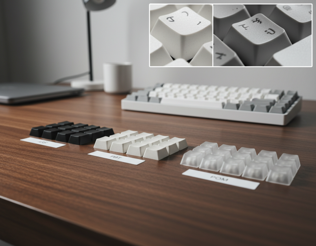
PBT vs ABS: what to expect
PBT is denser and resists gloss, so pbt keycaps keep a drier feel after months of use. PBT plastic shows less shine and usually lasts longer under daily typing.
ABS and abs keycaps start smooth and can develop a glossy sheen with heavy use. ABS often sounds slightly brighter and may show wear faster.
Legends that stay readable
Doubleshot legends are molded from a second layer of plastic, so the legends never wear off. Dye-sublimation embeds dye into the cap surface and is common on many pbt sets for crisp contrast.
Thickness, texture, and listing signals
Look for thickness around 1.6–1.7 mm for a solid, premium feel and fuller sound. A consistent, light texture hides fingerprints and helps control finger glide.
- Check listings for explicit tags: pbt, doubleshot, dye-sub, and exact thickness.
- Avoid vague marketing—favor clear material and legend methods in the spec sheet.
“Prioritize confirmed material and legend methods over fancy names when you shop.”
Keycap profile and typing feel for a clean, comfortable build
Choosing a profile is one of the fastest ways to dial in comfort and tone for a clean build. The profile describes the shape and height of keys across rows, and it affects look, ergonomics, and typing feel.
Everyday comfort: Cherry and OEM
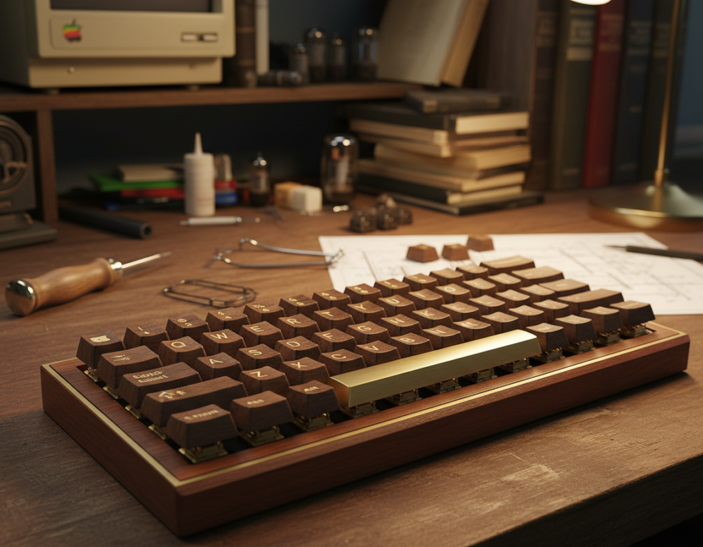
Cherry profile is the everyday favorite for many mechanical keyboards. It balances a low, sculpted slope with broad aftermarket support and familiar typing feel for long sessions.
OEM is slightly taller and common on prebuilt boards. It feels familiar to many users and makes swapping a set easier without changing hand posture much.
Uniform low profiles: XDA and DSA
XDA and DSA keep rows consistent, which reduces visual noise and supports a minimalist desk. Their flat, uniform tops can speed up short bursts of typing but may feel different during long sessions.
Sculpted silhouettes: ASA, SA, and MT3
Taller sculpted profiles like ASA, SA, and MT3 add a refined, vintage silhouette. They change finger travel and acoustic character, giving a fuller sound and a more pronounced tactile rhythm.
How profile impacts sound and long-session comfort
Lower profiles often produce a snappier, faster response. Taller profiles change acoustics and can feel more cushioned for long typing periods.
Pick a profile that matches your desktop style and supports the typing habits you keep every day.
Compatibility checks before you buy a set
A brief compatibility checklist prevents common mismatches when swapping sets.

Start by confirming the target keyboard layout. 60%, 65%, 75%, TKL, full-size, and 96% layouts change which keys and rows you need. A set that lists 104 keys may still miss special modifier sizes on compact layouts.
Understand layout coverage
Know which keys your board uses. Compact layouts often drop extra keys or use nonstandard bottom rows. A missing modifier or spacebar size means the set will “almost fit” but not work without extras.
Check switch stem fit
Most modern sets support Cherry MX switches and MX-style clones. Confirm that listing notes this explicitly. If your switches are non-MX stems, stop and verify before ordering.
Bottom-row, spacebars, and base kit details
- Look for included base kit coverage and advertised spacebar sizes (6.25U common).
- Watch for nonstandard modifiers—some boards need split or odd-width keys.
- A clear key count and row listing in the product details reduces surprises.
Final tips: pick a set that lists language or legend options if you need English or Japanese sublegends. Use a keycap puller when swapping caps to avoid damage. These simple checks keep returns low and installs smooth.
Buying tips for getting the best value without sacrificing the vibe
Buying smart means locking in fit and basic coverage before chasing premium extras. Start with a dependable base kit that fits your layout, then plan accents and spacebars as follow-ups.
Prioritize the base kit, then add accents and spacebars later
Choose a complete base set that covers your layout first. A full kit avoids awkward gaps and extra costs from aftermarket singles.
Once the base is secure, add one muted accent—grey, beige, or moss—to keep the look cohesive. Limit novelty caps to a single row so the desk stays calm.
Balancing aesthetics with function: readability, lighting, and distraction-free legends
Low-contrast legends look clean but must remain readable under your typical desk lighting. Test photos or seller lighting previews before you buy.
Prioritize legibility for late-night work: clear production methods like dye-sub or doubleshot are safer bets for durable, readable legends.
Spotting quality indicators in listings: material, profile, production method, key count
Scan listings for explicit features: PBT or ABS, named profile (Cherry/OEM/XDA/ASA), dye-sub or doubleshot, and total key count.
- Value tier: common set 45.99 offerings usually list PBT, Cherry profile, and ~170 keys.
- Dream upgrades: dream keycaps cost more but deliver tighter color matching, sharper legends, and fuller kits.
- New keycaps path: start neutral, then refine with premium caps as needed.
“Buy for fit first; upgrade for finesse later.”
Conclusion
Finish your build with a simple decision flow: choose a calm design direction, pick a profile that suits your hands and sound taste, then confirm fit and coverage before you spend.
PBT usually wins for long-term wear. It resists shine and holds legends better than most ABS plastic options. When budget matters, ABS can work, but check the production method and declared material closely.
Prioritize clear listing proof for legend method and material. Neutral keycaps show wear over time, so facts beat hype.
Quick checklist: re-check base coverage, switch fit, and have a puller on hand. Then use a shop-by-color approach, shortlist 2–3 sets, compare price versus features, and buy the one that best fits your workspace and daily typing needs.